Top 5 Picks!
In this article, we have gathered some of our favorite creative designs that we have discovered over the past few weeks. It’s always fun to make a list of what inspires us creatively and finding new creations that influence our desire to make high-quality custom packaging.
1. Creative Meat Packaging
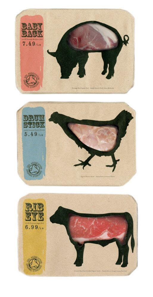
This cleverly designed meat packaging idea caught our eye recently. We have added to our list as it combines an excellent idea to make the meat itself visible to the consumer with a playful use of color and minimal design.
When thinking outside of the box, it is possible to create packaging that not only contains and protects the item itself, but goes the extra mile to make the packaging compliment the product. This packaging is a perfect example of this, and its something that we will see more of the future.
Food packaging benefits greatly from windowed designs. When consumers are buying food, the ability to see and inspect the food is nearly essential. This designs makes the meat shopping experience fun, and also allows for maximum view of the meat itself which only serves to be more convenient.
2. Fun and clever tissue dispenser
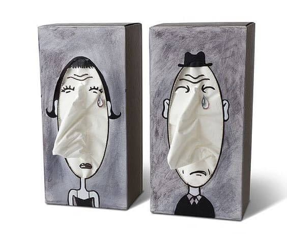
Any packaging that makes us laugh almost always makes it into our favorites. This design for a tissue dispenser box is one of those that are also clever. The structure is extremely simple, a cardboard box that has a die-line cut out the hole in the top.
What sets it apart from the rest is the clever and playful design that uses the product to interact with the customized packaging design.
This creative approach to design helps to create a lasting impression with consumers that help brand identity and sales.
3. ECO Friendly Wine Packaging
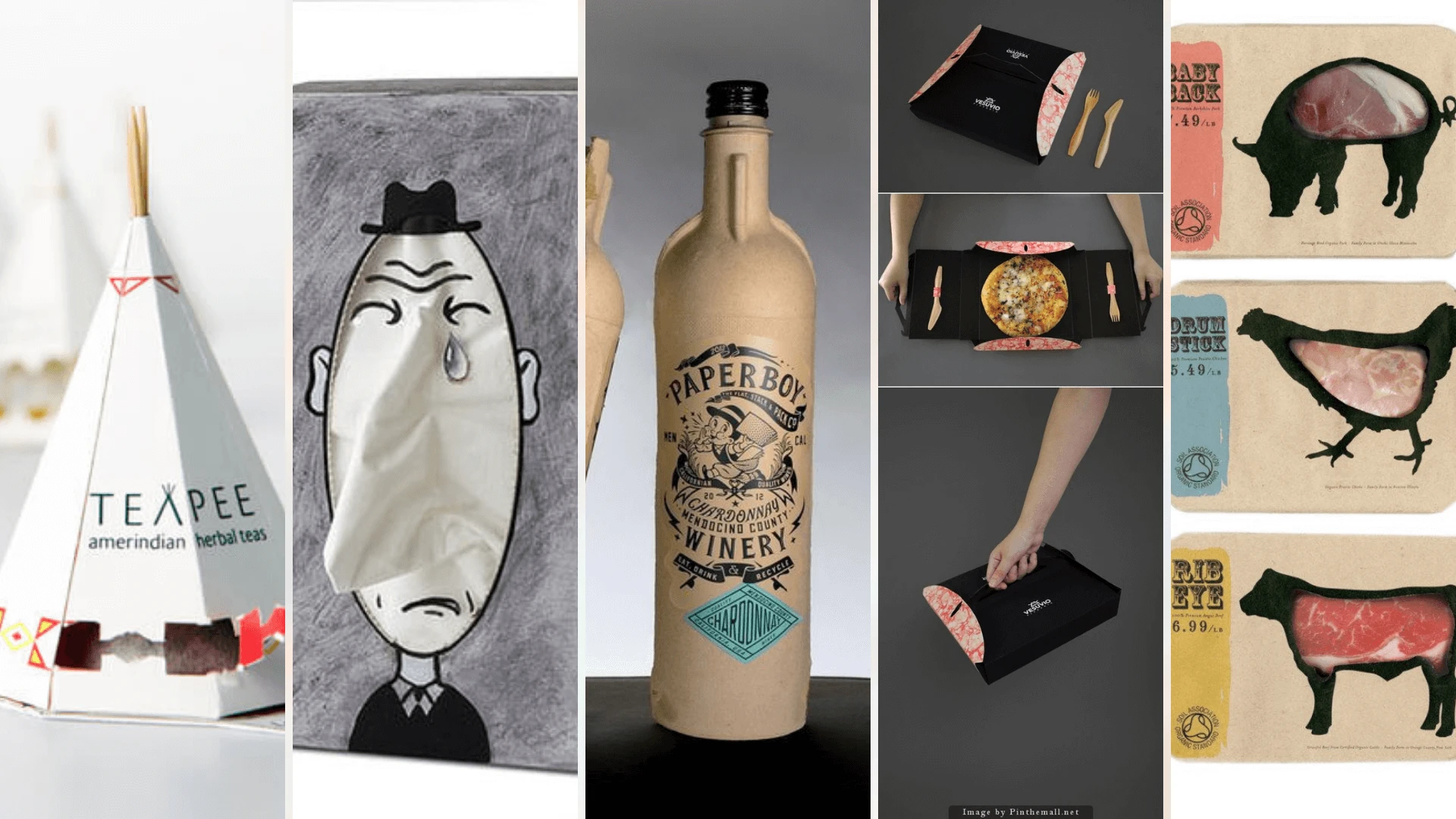
A professional packaging company in 2021 should be thinking about the effect that it has on the planet. We are extremely focused on sustainability and ECO-friendly working practices at He Tien.
So, when we saw this original and mindfully sustainable packaging choice for wine bottles, we instantly loved it! The design’s resourceful nature impresses us as it is not often seen within the wine industry.
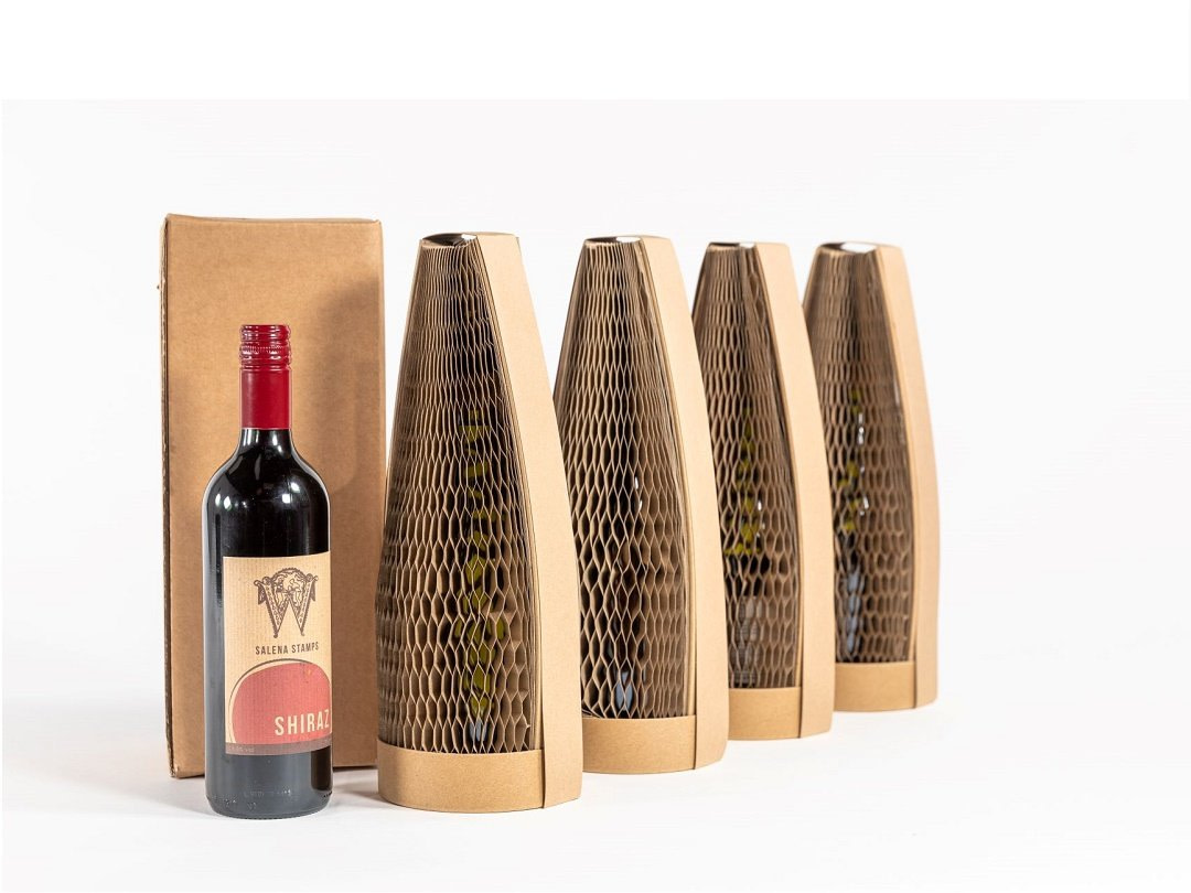
4. Simple and Elegant - Teapea Tea Bag
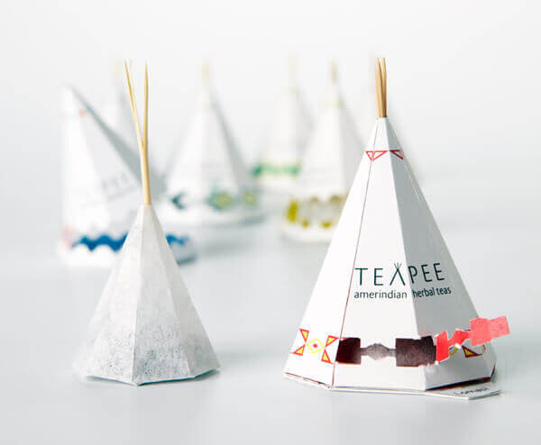
Simplicity is often a great design choice for packaging. Especially when the emphasis relies on the shape of the product itself. An example of this ‘less is more design approach can be seen in this really awesome teabag, ‘tea pea’ style packaging.
The designers use a shape of a tea pea as inspiration for this packaging, presumably because it’s a fun and visually engaging idea, but also because it excellently serves the functionality of the product. The ‘tea pea’ shape actually works very well as a tea bad and as the packaging. Bravo!
5. Nut Container - Simple but Effective
This design is all about the theme of the packaging. Using the wooden imagery as the packaging design provokes the idea of nature, forests, trees, and wood. As the product itself is nuts and seeds, it is obvious why they choose this imagery to bring attention to their product.
Another very creative addition to this design is the windowed die line cut on the front. Allowing the consumer to see the food itself,
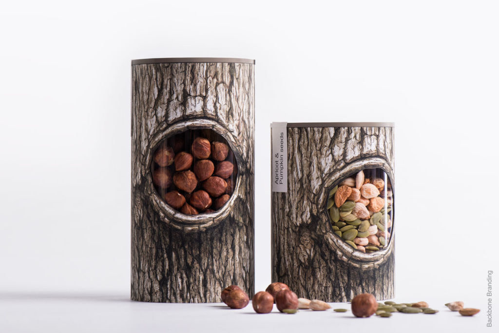
We hope you enjoyed our top 5 picks! If you feel inspired to create your own custom packaging, He Tien have you covered every step of the way.
Get your Free Quote here!

