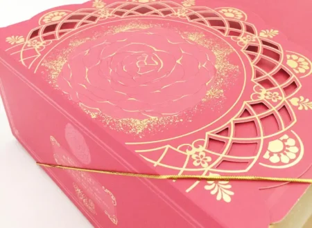
Packaging design requires different skills and considerations, variables like measurements, structure, material, surface treatment, and printing process, and so on will affect the result.


The artwork is the overall design of your packaging: Size, type, location, color, treatment of font, frames, art designs, surface treatment: The artwork contains all this information. As you already imagine, the artwork is not an easy process, and it is a key factor of the packaging construction. But don’t worry here are the basic parts to assure the best packaging:
- Typography
What is and why is important? In basic words, typography is the art of arranging letters in a legible, visually attractive, and clear way. In marketing, font builds brand recognition, influences the purchase decision, and of course, communicates.

One example of it is Coca-cola, whose font type is officially own by the brand. The font itself represents the brand. But you also can found other examples of it. In the creation of your artwork, not just the font is important, color, location, and treatment are also key variables:
Color:
A color can communicate, so when you choose a color for your packaging, think about how do you want that color to represent your product and your brand messages, how does that color can adapt to your client’s requirements.
Read more: Color psychology in packaging
Location:
Remember to use the design space wisely, keep in mind the structure of your packaging, and how your customer will interact with it. The product name should be the focal point; ingredients and instructions must be in a visible place, legible, and clean. Does your product offer special features? Highlight them!
The artwork is a code for the design the instructions of the packaging construction are there. The surface can be: Embossed, debossed, Spot UV, Foil Stamping, and many other special printing processes.


2. Art Design
Logo or any other design you may add to your packaging will be here. At the moment of setting the budget for your package, this is an important aspect, it will let you know: The plates, printing colors, and treatments your packaging will have. The artwork will show you in a digital form how your package will be.
3. Surface treatment
The same way as the font, the surface of your packaging and the art design can have a surface treatment, in other words, different kinds of printing techniques that will make vary the final product The type of treatment, the area, and the design depend on the intention, budget, size, and material. A small area with embossing won’t be clear, a material with texture doesn’t need treatment, each treatment requires plates, a package with many of them will be more expensive than one with no treatment.

As you can see, there are many factors needed to take into consideration. However, you may check these key factors to have a standard packaging that meets your need.
Update-to-date
Any change you add must be on the artwork, make sure you are working on your last version file, and remember that all your team should do the same. Differences in the artwork will make the result different from your expectations.
Size
Make sure that the area you are working on is the same as your dieline, a variation on this step is going to cause that your dieline doesn’t fit in your package and will affect the result.
Informative
Ingredients, precautions, and other information must be an important part of your design, remember that you should keep them in a visible and clear space.


